Paint Colors in Homes
Paint Colours in Homes
I’ve loved how a well-chosen paint colour can completely transform a space. Light rooms make a home feel open, fresh and inviting, creating the perfect backdrop for everyday living. At the same time, I like a bold accent wall, it adds personality without overwhelming the space. The right balance between soft light tones and a striking feature wall can make any room feel both peaceful and beautifully designed.
What’s Trending Right Now
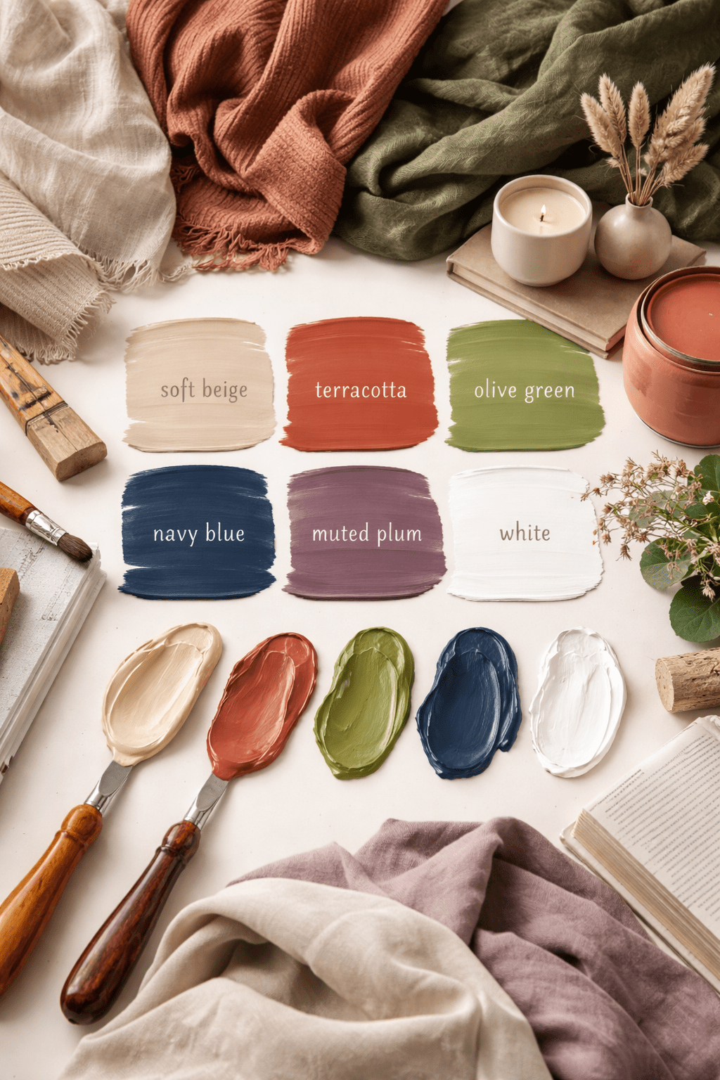
Current paint trends are leaning toward warm, natural tones. Soft beiges, creamy whites, and warm greige (a mix of gray and beige) are replacing cooler grays that dominated in previous years. Earth-inspired colours like terracotta, clay, olive green, and muted browns are also becoming popular. These shades create warmth and make a space feel inviting rather than stark. Deep accent walls are trending too, especially in colours like navy blue, forest green, charcoal, and even muted plum. Instead of bright, bold tones, homeowners are choosing rich, grounded versions of classic colors.
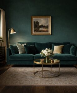
Colours That Look Rich and Luxurious
If you want your home to look expensive, depth is key. Dark, saturated colours tend to feel more luxurious than pale ones. Think deep emerald green, navy blue, charcoal gray, chocolate brown, or burgundy. These shades create contrast and drama, especially when paired with gold, brass, or matte black fixtures. Warm whites and creamy off-whites can also look high-end when used correctly. The secret is avoiding overly bright, blue-toned whites and choosing softer shades that feel layered and intentional. Another trick for a rich look is using different shades of the same colour throughout a space. This creates a cohesive feel.
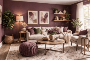
Colours for a Peaceful Environment
For a calm and relaxing home, soft muted tones work best. Light sage green, dusty blue, pale lavender, warm taupe, and soft sand are excellent choices. These colours are gentle on the eyes and help create a sense of balance. Nature-inspired shades are especially calming because they mimic outdoors. Soft greens and blues are known to reduce stress and make spaces feel airy and open. Bedrooms and living rooms benefit most from these peaceful tones. Avoid overly bright or highly saturated colours in spaces meant for relaxation, as they can feel stimulating rather than soothing.
The best paint colour ultimately depends on the mood you want to create. Warm neutrals and earthy tones are trending, deep saturated colours feel rich and elegant, and soft muted shades create peace and comfort. When choosing a colour, consider your lighting, furniture, and the atmosphere you want your home to reflect. A well-chosen paint colour can make any space feel intentional, stylish, and welcoming.

Get to Know Your Friendly Realtor, Agent Cherita